
The Setup
The folks at MailChimp do excellent UX work, and their signup form is no exception. As a personal exercise, I decided to recreate their signup form with AngularJS; which ended up being a great learning experience so I decided to share some of my favorite parts with you in this blog post. I would also be remiss if I did not mention that this entire post is standing on the shoulders of the excellent work that Matias Niemelä did around forms and ngMessages in AngularJS 1.3.
Links to the code and demo are below. I took the demo pretty far (given reasonable time constraints) but I would love to hear your ideas on how to make it even better. Let me know!
Demo CodeShowing Prompts
The first thing we are going to tackle is showing the user a helpful prompt when a text input receives focus. We want to show a prompt when the email and username fields receive focus so we will create a flag called showEmailPrompt and showUsernamePrompt to keep track of whether or not we should show a prompt. We will also create setter functions called toggleEmailPrompt and toggleUsernamePrompt that we will use to explicitly set the value of showEmailPrompt and showUsernamePrompt, respectively.
angular.module('ngMailChimp', ['ngMessages', 'ngAnimate'])
    .controller('SignUpController', function () {
        var ctrl = this;

<pre><code>    var toggleEmailPrompt = function (value) {
        ctrl.showEmailPrompt = value;
    };

    var toggleUsernamePrompt = function (value) {
        ctrl.showUsernamePrompt = value;
    };

    ctrl.showEmailPrompt = false;
    ctrl.showUsernamePrompt = false;
    ctrl.toggleEmailPrompt = toggleEmailPrompt;
    ctrl.toggleUsernamePrompt = toggleUsernamePrompt;
})
</code></pre>
Don’t forget to include the ngMessages and ngAnimate submodules!
We will also initialize showEmailPrompt and showUsernamePrompt to false since we want to suppress the prompts initially.
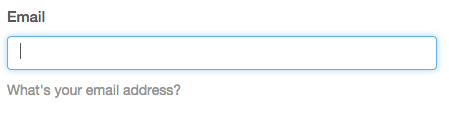
Now that we have a flag set on our controller, we can toggle the visibility of the prompt using ng-if.
<div class="my-messages">
<div class="prompt message-animation" ng-if="ctrl.showEmailPrompt">
        What's your email address?
    </div>
</div>
We can control that flag by calling ctrl.toggleEmailPrompt on ng-focus and ng-blur. On focus, we pass in true to show the prompt and on blur we will send in false to hide the prompt.
<input id="email" name="email"
    class="form-control" type="email" required
    ng-model="ctrl.newCustomer.email"
    ng-model-options="{ updateOn : 'default blur' }"
    ng-focus="ctrl.toggleEmailPrompt(true)"
    ng-blur="ctrl.toggleEmailPrompt(false)"/>

<div class="my-messages">
<div class="prompt message-animation" ng-if="ctrl.showEmailPrompt">
        What's your email address?
    </div>
</div>
Since maximizing the user experience is the goal here, we are going to add in a simple animation to enhance the showing and hiding of the prompt.
Shout out to my buddy Kent C. Dodds for giving me the idea to do this. I highly recommend his videos on egghead.io. They are excellent!
We are going to hook an animation into our prompt by adding the message-animation class. And in our animations.css file, our animation will operate by modifying the opacity and margin-top properties of the element. When ng-enter is triggered, we will start with opacity: 0 and margin-top: -20px, then finish with the application of the ng-enter-active class and opacity: 1 and margin-top: 0.
.my-messages {
    position: relative;
}

.message-animation {
    transition: 0.2s ease-in-out all;
}

.message-animation.ng-enter {
    opacity: 0;
    margin-top: -20px;
}

.message-animation.ng-enter.ng-enter-active {
    opacity: 1;
    margin-top: 0;
}

.message-animation.ng-leave {
    opacity: 1;
    margin-top: 0;
}

.message-animation.ng-leave-active {
    opacity: 0;
    margin-top: -20px;
}
We will essentially do the exact opposite for ng-leave and ng-leave-active. In fact! I separated these classes out for readability; but I will often stack them for conciseness.
Showing the Password
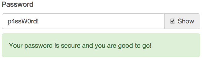
The next feature that I would like to build out is the ability to toggle password visibility on the password field. AngularJS is awesome in that we can bind to any value of any attribute and make it dynamic. In this case, we are going to bind to the type property of the password input field to the value returned by ctrl.getPasswordType. Notice that the password field is part of an input-group, which is a Bootstrap component that allows us to nestle a checkbox onto the end of the element. We will set the value of that checkbox to control a value called showPassword via ng-model=”ctrl.signupForm.showPassword”
<div class="input-group">
    <input id="password" name="password" class="form-control" required
           type="{{ctrl.getPasswordType()}}"
           ng-model-options="{ updateOn : 'default blur' }"
           ng-model="ctrl.newCustomer.password"/>
    <span class="input-group-addon">
        <input type="checkbox" ng-model="ctrl.signupForm.showPassword"> Show
    </span>
</div>
And in the getPasswordType method, we are checking if ctrl.signupForm.showPassword is true or false and then returning ‘text’ if it is true and ‘password’ if it is not.
.controller('SignUpController', function () {
    var ctrl = this;

<pre><code>var getPasswordType = function () {
    return ctrl.signupForm.showPassword ? 'text' : 'password';
};

ctrl.getPasswordType = getPasswordType;
</code></pre>
})
I was pleasantly surprised that that was all I needed to implement such a useful UX pattern.
Using ngMessages
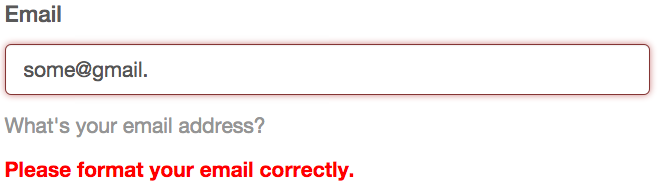
In the first example, we gave the user a generic prompt to guide them in filling out the field appropriately. We are going to take that a step further and use ngMessages to give the user specific feedback on the the state of their input. ngMessages makes managing this feedback really easy, compared to having to wrangle error messages via a huge heap of ng-if statements (which was necessary prior to AngularJS 1.3).
The first thing that we need to do when setting up ngMessages is to create a message container and bind it to a specific field in the form. We are going to focus on the email field, so we will accomplish this goal with this bit of code here: ng-messages=”ctrl.signupForm.email.$error”.
<div class="my-messages"
    ng-messages="ctrl.signupForm.email.$error"
    ng-if="ctrl.showMessages('email')">
</div>
And now we just need to add in a message for each error that we want to capture. We define the specific error using ng-message and the error we want to track like this: ng-message=”required”.
<div class="my-messages"
    ng-messages="ctrl.signupForm.email.$error"
    ng-if="ctrl.showMessages('email')">

<div class="message-animation" ng-message="required">
        <strong>This field is required.</strong>
    </div>
<div class="message-animation" ng-message="email">
        <strong>Please format your email correctly.</strong>
    </div>
</div>
When ctrl.signupForm.email.$error.required is true, the element containing the error message is shown to the user. This is really nice because we still have the ability to display the error however we want based on the HTML we choose to display.
Also, notice that there is an ng-if on the ng-messages div in the form of ng-if=”ctrl.showMessages(’email’)”. By default, messages are shown immediately and ctrl.showMessages is a convenience function that allows us to override that behavior.
We are essentially passing in the field name to the method and then checking to see if that field has been touched via $touched or if the form itself has been submitted via $submitted. By using the array syntax to dynamically evaluate the field, we are able to use this method in more than one place and cut down on some of the DOM clutter.
.controller('SignUpController', function () {
    var ctrl = this;

<pre><code>var showMessages = function (field) {
    return ctrl.signupForm[field].$touched || ctrl.signupForm.$submitted
};

ctrl.showMessages = showMessages;
</code></pre>
})
We are going to apply the same technique by dynamically evaluating if we should apply a has-error class to the input element. If this field has been $touched and is $invalid, we return true so that the class can be applied.
.controller('SignUpController', function () {
    var ctrl = this;

<pre><code>var hasErrorClass = function (field) {
    return ctrl.signupForm[field].$touched
        && ctrl.signupForm[field].$invalid;
};

ctrl.hasErrorClass = hasErrorClass;
</code></pre>
})
The has-error class is then dynamically applied to the DOM using ng-class.
<div class="form-group" ng-class="{'has-error':ctrl.hasErrorClass('email')}">
</div>
Custom Validators
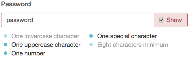
And now for the grand finale! We are going to create a set of custom validators and apply them to the password field. We are also going to track each validator and give the user feedback when each of the validation requirements has been met. The foundation for this starts by creating a directive (which we will call validatePasswordCharacters), then requiring ngModel and passing it in as a parameter to the link function. We can access the $validators object on ngModel and create our own custom validators such as lowerCase, upperCase, eightCharacters, etc.
.directive('validatePasswordCharacters', function () {
    return {
        require: 'ngModel',
        link: function ($scope, element, attrs, ngModel) {
            ngModel.$validators.lowerCase = function (value) { };
            ngModel.$validators.upperCase = function (value) { };
            ngModel.$validators.number = function (value) { };
            ngModel.$validators.specialCharacter = function (value) { };
            ngModel.$validators.eightCharacters = function (value) { };
        }
    }
})
Each validator accepts a single value argument that is evaluated and, depending on whether or not it meets a predetermined condition, will return true or false. For instance, in the eightCharacters validator, we are checking to make sure that value is defined and value.length is equal to or greater than 8. When this returns true, we know that the requirement (a password at least 8 characters long) has been met.
.directive('validatePasswordCharacters', function () {
    return {
        require: 'ngModel',
        link: function ($scope, element, attrs, ngModel) {
            ngModel.$validators.lowerCase = function (value) {
                var pattern = /[a-z]+/;
                return (typeof value !== 'undefined')
                    && pattern.test(value);
            };
            ngModel.$validators.upperCase = function (value) {
                var pattern = /[A-Z]+/;
                return (typeof value !== 'undefined')
                    && pattern.test(value);
            };
            ngModel.$validators.number = function (value) {
                var pattern = /\d+/;
                return (typeof value !== 'undefined')
                    && pattern.test(value);
            };
            ngModel.$validators.specialCharacter = function (value) {
                var pattern = /\W+/;
                return (typeof value !== 'undefined')
                    && pattern.test(value);
            };
            ngModel.$validators.eightCharacters = function (value) {
                return (typeof value !== 'undefined')
                    && value.length >= 8;
            };
        }
    }
})
The other validators work on the exact same premise but use REGEX to ensure that some criteria has been met.
We now have this set of validators that have been neatly wrapped up in a directive. How do we apply them to an element? We do that by instantiating it like any other directive. We convert validatePasswordCharacters from camel case to snake case and attach it to the password input as validate-password-characters.
<input id="password" name="password" class="form-control" required
       type="{{ctrl.getPasswordType()}}"
       ng-model-options="{ updateOn : 'default blur' }"
       ng-model="ctrl.newCustomer.password"
       validate-password-characters/>
And then we can use the validators to dynamically attach a completed class to our list of requirements as each of them has been met. Notice that there is now a property on the $error object that matches the name of the validator that we added.
<div class="password-requirements" ng-if="!ctrl.signupForm.password.$valid">
<ul class="float-left">
<li ng-class="{'completed':!ctrl.signupForm.password.$error.lowerCase}">
            One lowercase character
        </li>
<li ng-class="{'completed':!ctrl.signupForm.password.$error.upperCase}">
            One uppercase character
        </li>
<li ng-class="{'completed':!ctrl.signupForm.password.$error.number}">
            One number
        </li>
</ul>
<ul class="selfclear clearfix">
<li ng-class="{'completed':!ctrl.signupForm.password.$error.specialCharacter}">
            One special character
        </li>
<li ng-class="{'completed':!ctrl.signupForm.password.$error.eightCharacters}">
            Eight characters minimum
        </li>
</ul>
</div>
This was by far my favorite feature of the entire experience and I am really impressed with how easy it was to declare and harness custom validators in my form.
Review
There are a few extra goodies in the repository for you to go and play around with but I feel like we are at a good stopping point so let us do a quick review.
- We can use a boolean flag to toggle the visibility of an element with ng-if.
- We can use the ng-focus and ng-blur event to modify that boolean flag to show a prompt when an input receives focus and hide it when it has lost focus.
- We can bind to any value of any attribute with AngularJS and do clever things like dynamically changing the type of an input field from password to text and back again.
- We can easily enhance that experience using ngAnimate and a few simple CSS transitions.
- ngMessages allows us to easily and neatly control how we display error messages for an input field.
- We can create custom validators by attaching them to ngModel.$validators within a directive.
- When we define a new validator, it becomes a property on on the $error object for us to track.
Resources
This has been a super fun post to writea. Also, I am extremely grateful to Kent and Matias for being great friends and helping me be better; thank you for giving me all the reason I need to sit down and write this post. Last but not least, a huge shout out to MailChimp for creating great tech that captures my imagination.
How to use ngMessages in AngularJS
Demo Code


Awesome walk-though, I imagine there is a way to refactor that “Showing Prompts” sections to be a bit more reusable.
For example, if you made a directive that was isolated, something like “modifiedInput” it could take a couple of attributes, like the prompt message and use that with a template to create the prompt area. You could then simply watch the input of the directive, do the necessary logic in the link function to hide and show the prompt message. You could even do it with transclusion and skip the whole attribute stuff.
I feel like that’s a bit more reusable and you also don’t have to depend on a controller to handle your logic! Obviously this would be better only if you were using it a lot more, otherwise I think your solution is good too!
-N
Nicholas — great points! If you are up for it, you should fork the repo and put together a quick example. I would love to collaborate on that idea for another blog post. #highFive
Ya! I built a plnk here – http://plnkr.co/edit/7wuprk?p=preview
The first box has the info in the controller and second has it in the link function. Not sure which is more advantageous.
I went with the templateHtml route, because it’s super clean DOM usage, but if you go the transclusion route remember that anything transcluded is not in the isolate scope of the directive.
One cool things is that you have isolated access to the input box model so you can use it in your link function or template if you want and have the message be like – username {{your input model}} is not valid ect…..
Awesome Lukas !!!
thanks !